

1. Introduction: The Language of Colour
Colour speaks to us in ways that words cannot. It has the power to evoke emotions, set a mood, and draw us into a work of art, often before we even recognize its subject. From the fiery reds of a sunset to the soothing blues of a calm sea, colour influences how we perceive the world around us—and art is no exception.
Artists throughout history have used colour to communicate ideas, provoke feelings, and transform the way we experience their work. Take Mark Rothko’s colour field paintings, for example. His seemingly simple blocks of colour can stir a sense of calm, unease, or introspection, depending on the viewer’s perspective. Rothko himself believed that colour was a direct path to emotion.
In this article, we’ll delve into the fascinating role of colour in art, starting with its scientific foundations and moving toward its emotional and symbolic power. By the end, you’ll see how colour transforms art into a universal yet deeply personal experience.
2. The Science of Colour: Hue, Saturation, and Value
At its core, colour is light, refracted and perceived by our eyes in various wavelengths. Artists harness this natural phenomenon, breaking it into three essential components:
Hue
Hue is the pure colour on the spectrum—red, blue, green, yellow, and so on. It’s what we typically think of when we name a colour. Artists use hue to create a specific mood or theme. For instance, in Claude Monet’s Water Lilies, the dominance of soft greens and blues evokes tranquility and harmony, mirroring the reflective surface of a pond.

Saturation
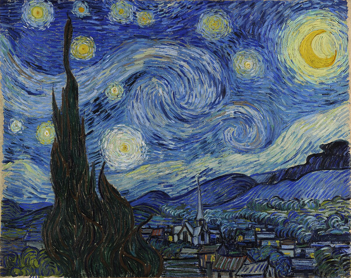
Saturation refers to the intensity or purity of a colour. A highly saturated colour is vivid and bold, while a desaturated one feels muted or neutral. In Vincent van Gogh’s Starry Night, the contrast between the vibrant yellows of the stars and the deep blues of the night sky creates an energetic yet serene effect. By carefully balancing saturation, Van Gogh gave his painting its dreamlike quality.
Value
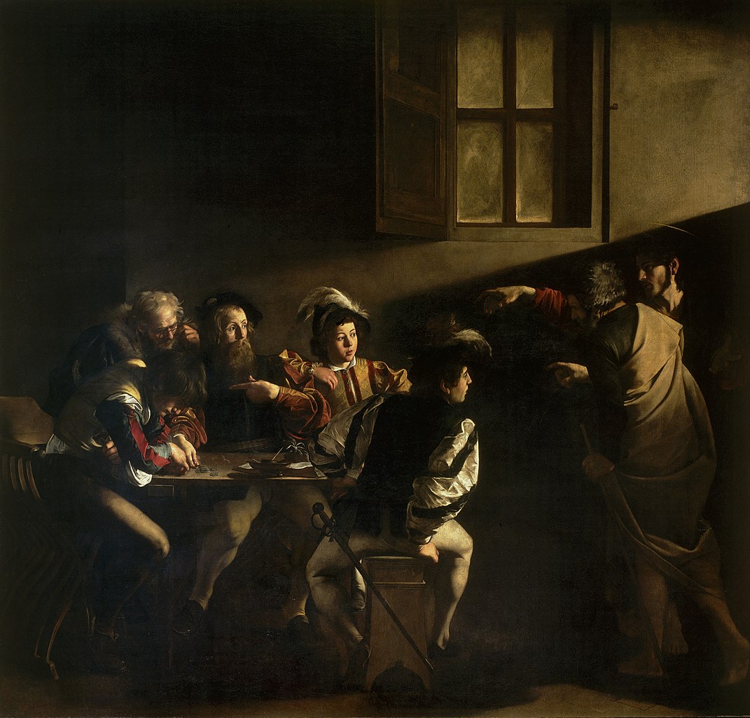
Value is the lightness or darkness of a colour, which adds depth and dimension. Artists use value to create contrast, highlight focal points, or suggest form and volume. In Caravaggio’s dramatic The Calling of St. Matthew, the stark contrasts between light and shadow (a technique known as chiaroscuro) emphasize the divine moment when Christ gestures toward Matthew.
Understanding these three components helps us see how artists manipulate colour to evoke emotion and shape our perception. Next time you view a painting, try breaking it down into hue, saturation, and value to uncover the artist’s intent.
3. Emotional Impact: How Colour Affects Us
Colour has a profound ability to evoke emotions, often without us even realizing it. Warm colours like red, orange, and yellow are known to convey energy, passion, and warmth. On the other hand, cool colours like blue, green, and purple create feelings of calm, introspection, or melancholy. These associations are deeply rooted in both nature and culture, which is why they resonate so universally.
One striking example is Picasso’s Blue Period, a phase where he used shades of blue and grey almost exclusively. This palette amplifies the sorrow and loneliness depicted in works like The Old Guitarist, where a frail man seems swallowed by the muted hues surrounding him. Here, blue doesn’t just create a mood—it becomes the mood.
Conversely, consider the bright, saturated colours of Henri Matisse’s The Red Studio. The bold use of red fills the canvas with energy and vibrancy, transforming a mundane interior into a dynamic celebration of creativity. Matisse understood that colour could be both literal and emotional, a tool to excite the senses and provoke thought.
The next time you see a painting, take note of how its colours make you feel. Do they energize you, soothe you, or draw you inward? This emotional connection is one of the most powerful aspects of colour in art.
4. Symbolism and Cultural Significance
Colour doesn’t just evoke emotions—it carries meaning, often tied to cultural, historical, or symbolic contexts. Artists use these associations to add depth and layers of interpretation to their work.
Cultural Variations in Colour
In Western art, white often symbolizes purity or innocence, seen in depictions of brides or religious figures like the Virgin Mary. Yet, in many Eastern cultures, white is the colour of mourning, representing the end of a cycle. Similarly, red in Western contexts may convey love or passion, while in Chinese culture, it often represents prosperity and good fortune.
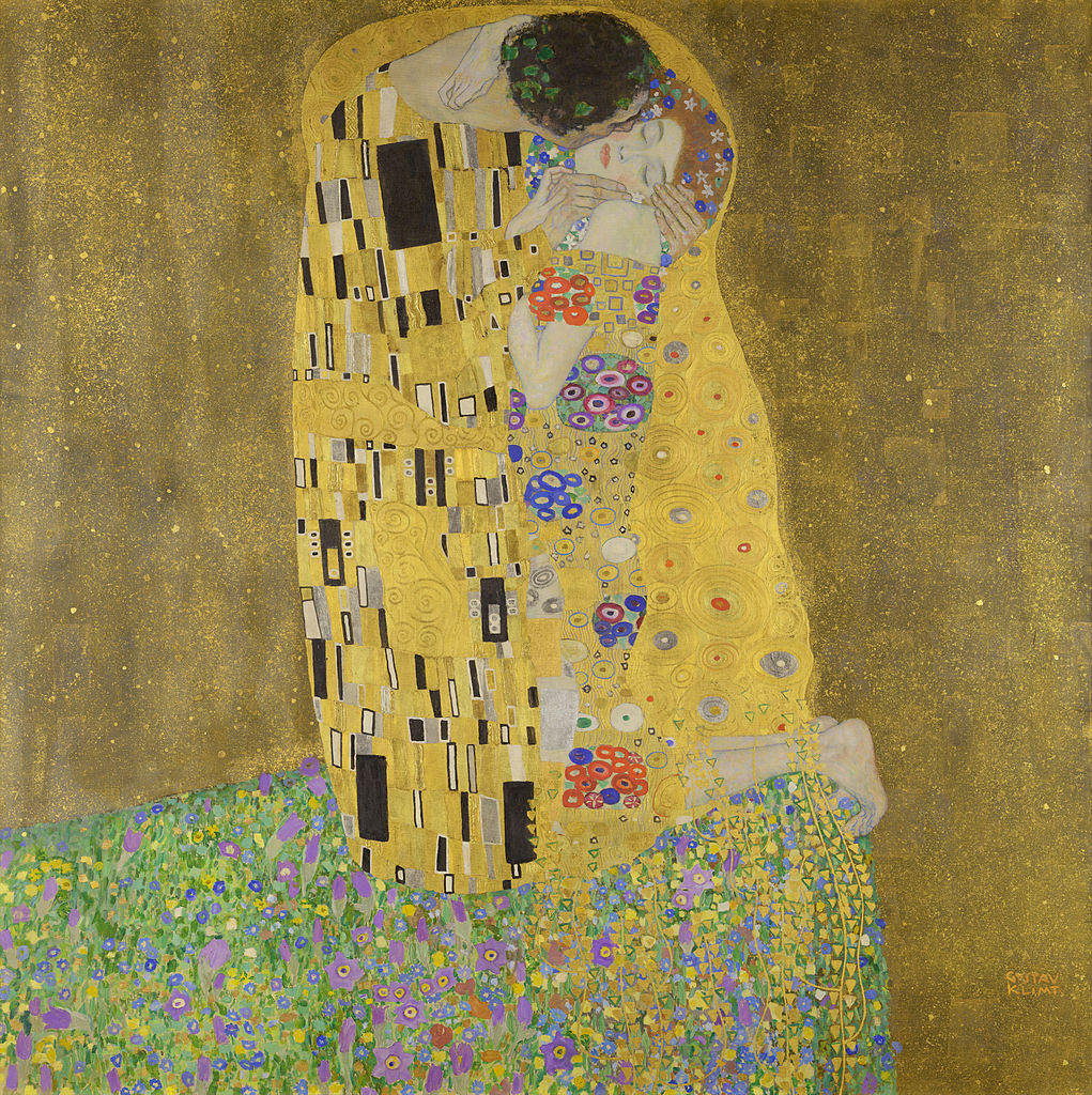
Artists tap into these associations to create resonance with their audiences. Gustav Klimt’s The Kiss, for instance, uses gold to evoke opulence, eternity, and transcendence, reflecting the influence of Byzantine mosaics on his work.
Symbolic Uses in Art History
In the Renaissance, gold leaf was used in religious art to symbolize the divine. This same principle applies to the haloed saints in Giotto’s frescoes, where the shimmering gold background sets the spiritual apart from the earthly.
Meanwhile, in the Romantic era, Turner’s fiery sunsets often symbolized the sublime—nature’s overwhelming power and beauty. More recently, contemporary artists like Kara Walker have used stark contrasts of black and white to explore themes of race and identity.
Understanding the cultural and symbolic significance of colour enriches our appreciation of art. It reveals the many layers artists embed into their work, making their creations not just visually appealing but also intellectually and emotionally profound.
5. Famous Artists and Their Use of Colour
Throughout history, certain artists have become synonymous with their innovative use of colour. Their works demonstrate how colour can be a defining element in creating impact and meaning.
Mark Rothko
Rothko’s large-scale colour field paintings are masterclasses in using colour to evoke emotion. Works like Orange and Yellow feature vast blocks of luminous colour that seem to pulse with energy. For Rothko, colour wasn’t just a visual element—it was a gateway to the sublime, a way to communicate raw human emotion.
Claude Monet
The father of Impressionism, Monet transformed light and colour into poetry. His series Water Lilies captures the changing hues of water and sky with subtle, almost musical shifts in colour. Monet’s ability to layer tones and capture fleeting moments of light made his work a celebration of nature’s beauty.
Henri Matisse
Known for his bold, expressive use of colour, Matisse was a pioneer of Fauvism. His vibrant palette wasn’t just about realism; it was about joy, movement, and life. In works like The Red Studio, Matisse used colour to create a space brimming with energy and creativity.
Each of these artists reminds us that colour isn’t just a tool—it’s a language, one that speaks directly to our hearts and minds.

6. Call to Action: Explore Colour in Art
Now that you’ve explored the science, emotion, and symbolism of colour, it’s time to engage with it firsthand. The best way to deepen your understanding is to observe how colour is used in the art you love.
Here’s how to start:
- Analyze an artwork: Choose a piece you enjoy and identify its dominant colours. How do hue, saturation, and value contribute to its overall effect?
- Pay attention to your emotions: Notice how the colours make you feel. Are they calming, energizing, or thought-provoking?
- Explore our marketplace: Discover the works of contemporary artists who use colour in innovative ways. Notice how their palettes shape your experience of their art.
By actively exploring colour in art, you’ll begin to see how it shapes not just what you see, but how you feel. Stay tuned for the next article in our series, where we’ll unlock the secrets of symbolism in art and how to uncover hidden meanings in your favourite pieces.
Previously in the series:
Leave a Reply